sehyeonjin.com

The Trevor Project

Responsive Web Design

Project Overview

Supporting LGBTQ Youth through Design

The Trevor Project is a nationwide nonprofit organization focused on suicide prevention of LGBTQ youth under 25. The website has not been suitable for users on mobile even though most of them may open the website using their phone.

Project

Individual Project

My Role

UX Designer,
Visual Designer

Duration

4 weeks

Tools

Figma

Objective

How might we improve usability on the website in order to help LGBTQ youth suffering from suicidal thoughts.

Solution

I redesigned some pages of the Trevor Project with a good visual hierarchy and well structured architecture.

Understanding the Problem

What is the Trevor Project?

The Trevor Project is an American nonprofit organization founded in 1998 focused on suicide prevention efforts among lesbian, gay, bisexual, transgender, queer, and questioning (LGBTQ) youth under 25. It operates The Trevor Lifeline, a confidential service through a toll-free telephone number and other channels such as TrevorText and TrevorSpace.

LGBTQ youth have much higher levels of suicidal ideation than heterosexuals. According to research, lesbian, gay and bisexual youth are 4 times more likely to attempt suicide as their heterosexual peers. 41% of transgender people also have reported attempting suicide.

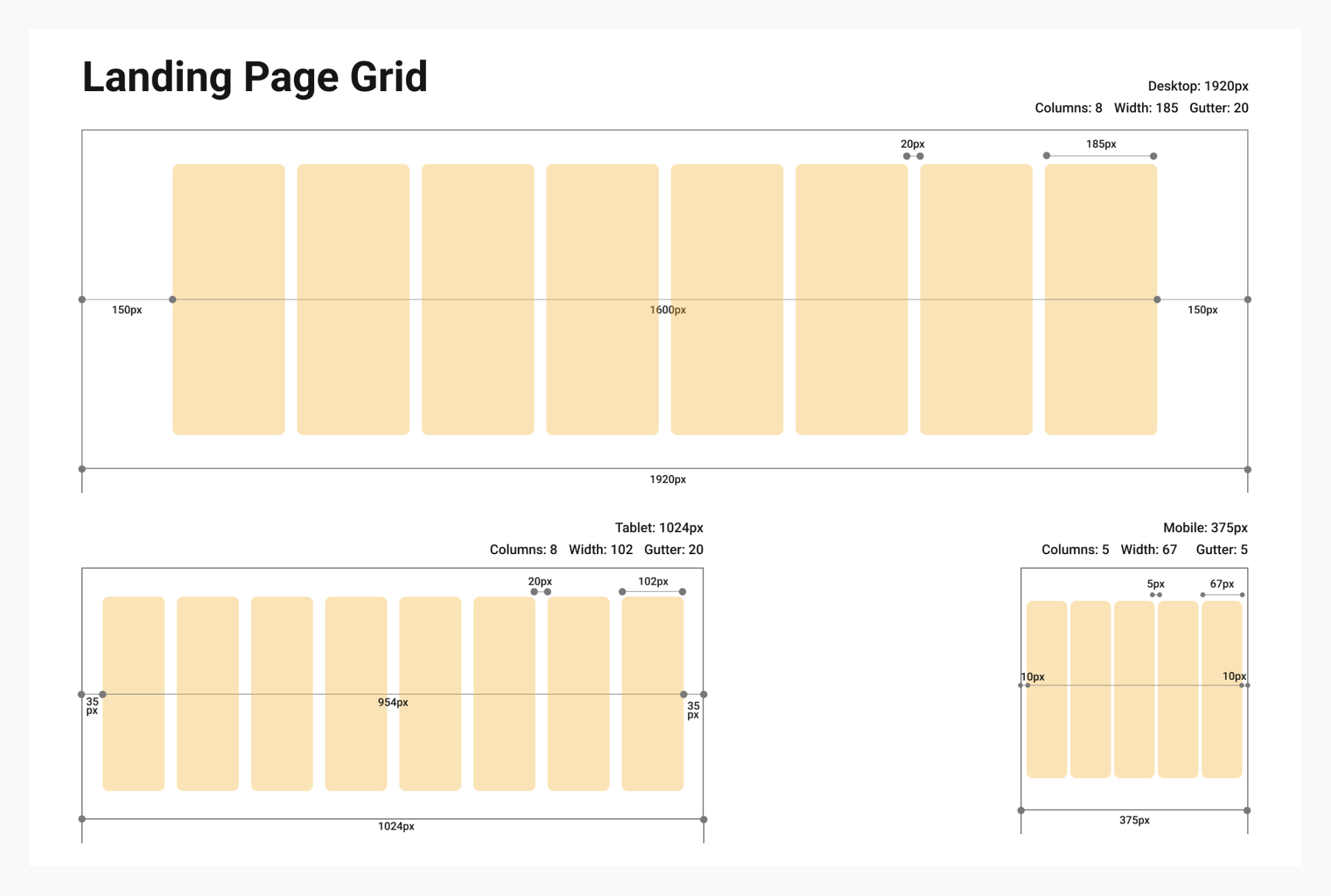
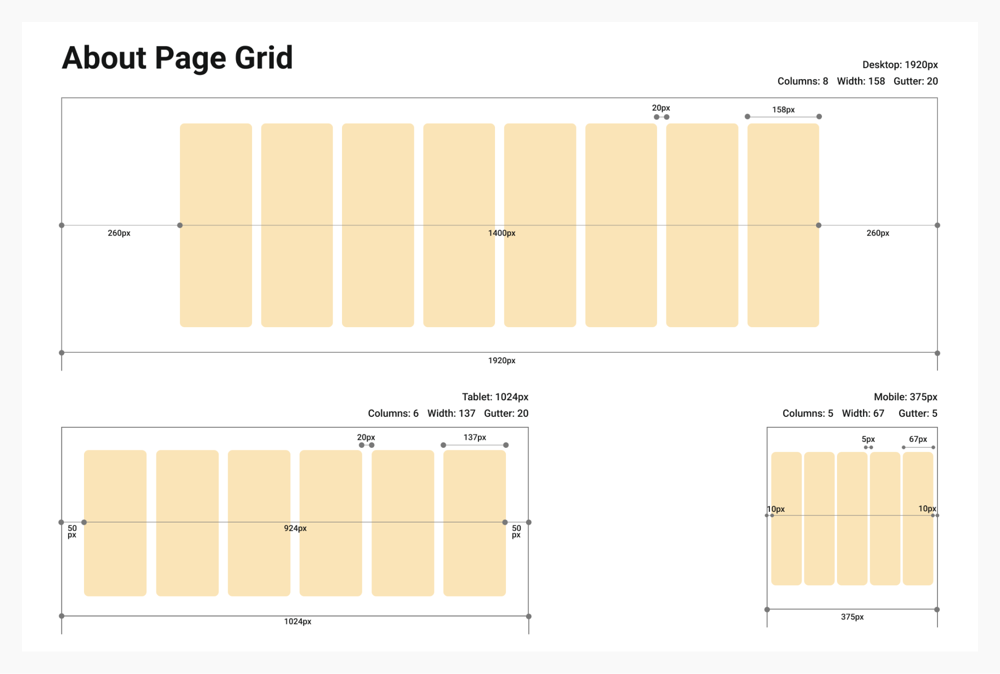
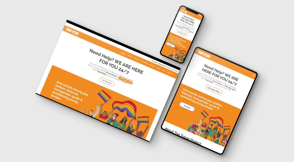
Why Responsive Web? Why Mobile First?

  • Mobiles are the device that teenagers are most likely to use to access the internet. 53% of children in the US own a smartphone by the age of 11 and 84% of teenagers now have their own phones.

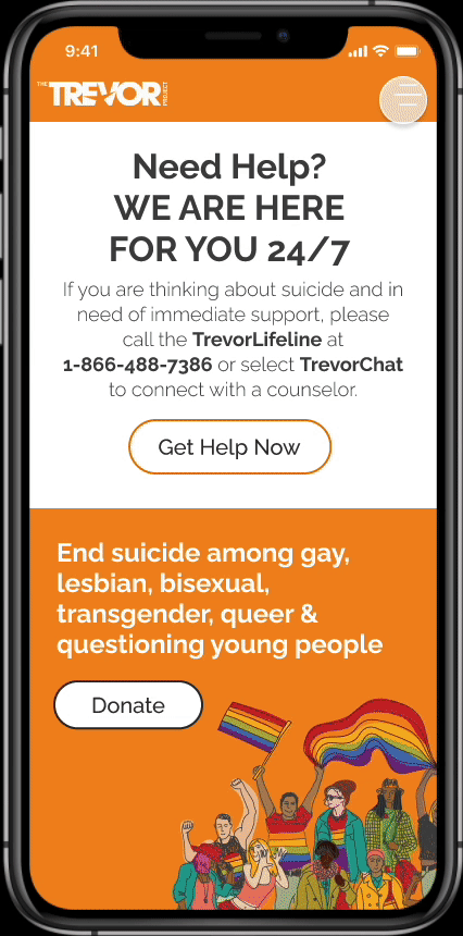
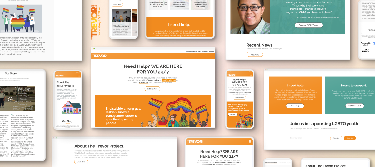
  • The nonprofit provides LGBTQ teens and yound adults under 25 with 24/7 online counseling via phone call, text and chat. Therefore, most of them can view the website and use the services on mobile devices.

Defining the Problem

1. Landing Page

Slide This navigation menu is not organized and labeled in an effective way. For instance, getting help and involved are the main services which would be clicked first. Some information of how to donating and getting help should be shown on the first page even though job openings are quite important to the nonprofit. Most users visiting this website would need some help as soon as possible when they encounter this page first. The whole design including mobile is so cluttered that users can get distracted on this page due to too many colors and the lack of visual hierarchy. Call to Action is also quite important on this page because the nonprofit should encourage users to get help or take a next step to donate. There are a few contents which users may want on the landing page. For the first time users, it should contain brief story about this organization.

2. About

Slide Users may want to know what the nonprofit is at a glance though, there are too many depths on this page. The whole page is also cluttered so that users can get distracted on this page due to the lack of visual hierarchy and balance including spaces.

Grid System

Font and Colors

Since the main color of the nonprofit is orange, I picked orange as a primary and blue green which is the opposite color of orange as a secondary color. Raleway is also unique but clean font that could draw our user’s attention.

How might we support LGBTQ youths who have suffered from suicidal thoughts?

And how might we increase the usability of the website?

Mobile

1. Landing Page

  • Well-organized Structure with a Good Visual Hierarchy
First, the menu and order of the navigation bar are rearranged in order to focus on user’s need. The size and scale, color of the elements are also changed in order to impress the users.
  • Made Users Be Involved
The Call to Action buttons are the key elements on the page. As a nonprofit organization which should encourage users to join, the new attracted CTA buttons may help users to take further action.
  • More Contents Which Users Would Want to Know
The first-time website visitors may want to know what the Trevor Project is, so that the brief information of the organization is contained on the landing page.

2. About

  • Simplified the Page
There were too many depth on the previous page, so that the whole page is redesigned to contain three key parts of the organization which may users including first-time visitors want to know.
  • Good Visual Hierarchy and Balance
The whole page is redesigned with more whitespaces and all visual elements are grouped in order to make users notice what’s important on the page.

Desktop

1. Landing Page

2. About

Tablet

1. Landing Page

2. About

What I've Learned

The first thing I did working on a web design project was to research the nonprofit and find target users. In this case, I inferred that the target users were people under 25 who needed some help and donors who wanted to donate. For that reason, mobile-first approach was the right choice because this website had to be more accessible. As it was my first UIUX project, I learned how to focus on user’s need and improve user’s experience under the organization’s objectives.

I also found out how to apply some visual design principles on the website. As it seems, there is a lack of visual hierarchy, scale and balance on the existing pages so that I redesigned some pages considering those principles. It was an opportunity to learn how to increase user engagement in UI design beyond making the website look beautiful.

More Projects

Kiddiez

Service Design

Mooday

Service Design

The Underdog Uprising

Data Analytics

Spotify for the HOH

App Redesign